How can a house built to display privilege become a space of genuine inclusion?
Speaking to the curators, we learned that access to Russborough's treasures is uneven. Visitors with disabilities, families of children with SEND, neurodivergent individuals and younger, more diverse audiences all face barriers that limit meaningful engagement — turning a shared cultural treasure into an inadvertently exclusive space.
Rather than limitations, we treated these as creative design prompts — pushing us toward sensory adaptation, spatial storytelling and intermediary perspectives instead of building work.
Her input shaped our approach to accessibility and emotional engagement. As she put it, Russborough isn't just about viewing objects — it's about atmosphere and memory.
Leads collections care, public learning and outreach. Her enthusiasm for openness and innovation made her an invaluable collaborator through every review.
A four-person team — Tanushri Tandon, Katie Devitt, Lipeng Wang and myself. My focus was accessible, user-centred design: running interviews and thematic coding, developing three of the twelve ideation concepts, and shaping the accessibility layer of the final app.
Mixed methods: semi-structured interviews with parents of SEND children, teachers and psychology professionals, plus a visitor survey distributed through the partners' outreach channels. Interviews were coded in MAXQDA using reflexive thematic analysis (Braun & Clarke, 2021); survey data was mapped onto the interview-derived themes to triangulate them.
Questions avoided deficit language throughout, and we kept reflexive journals to surface our own bias. The guide was piloted internally and revised for tone and emotional sensitivity before it went near a participant.
Investigating the physical, sensory and structural limitations of a site like Russborough, and identifying design opportunities inside them.
Understanding how they experience museums — sensory sensitivities, cognitive diversity, and the support structures that enable interaction.
Evaluating how mobile apps, virtual tours and personalised interfaces can adapt traditional heritage experiences to diverse learning styles.
"If there was a big group of 30, I wouldn't even go."
Advance reassurance and routine-building are decisive. Large groups amplify sensory stress; smaller, calmer formats are far more inclusive.
"If it's completely free, they might not do anything. But if you give a small little activity to guide them… they'll engage more."
Autonomy has to be balanced with structure. Digital tools were welcomed as long as they supported learning rather than distracted from it.
"A lot of neurodivergent individuals like to know when something has a start and an end."
Noise, lighting and unpredictable crowd movement trigger discomfort. Predictability is not a nice-to-have — it determines whether the visit happens at all.
"More interactive — my sons dislike museums usually because they don't want to stand and read everything."
Reflexive thematic analysis of the interview transcripts produced six themes. Everything downstream — personas, HMW prompts, feature set — was derived from these.
Predictability and pre-visit preparation supports engagement
Preparing SEND children in advance reduces anxiety and increases confidence — accessible pre-visit resources are the single highest-leverage intervention.
Adaptive support for emotional and sensory regulation is essential
Quiet spaces, reduced crowding and flexible pacing for children who become overwhelmed — adaptable sensory environments rather than fixed ones.
Communication accessibility and inclusive content foster participation
Verbal-only delivery and dense text are barriers. Participants advocated for visuals, symbols and plain language.
Flexibility and autonomy promote comfort within structure
Tight schedules hinder enjoyment. Greater freedom to move, explore and self-pace was consistently requested.
Creativity and play foster positive emotional connections
Visits were most impactful when they encouraged imagination and self-expression. Children responded to playful, creative environments.
Technology enables interaction when access needs are met
Well-designed digital tools aid focus, engagement and communication — but only when they're accessible in the first place.
The six themes became three personas representing the user groups we carried into ideation, each with an empathy map translating the themes into what they think, say, do and feel.
Jack loves history and learns best through visuals and hands-on activities. Autistic with ADHD, he thrives on clear routines, finds transitions overwhelming, and needs quiet breaks to stay regulated.
"I'm bored, they're just talking. Can I go outside for a break?"
Maya is autistic with sensory processing differences and enjoys museums when they're calm and accessible. She prefers plain language, uncluttered visuals and audio guides.
"Can I just explore at my own pace?"
Tommy uses a wheelchair and enjoys hands-on exhibits. He's independent but faces barriers like steps and high displays. Accessible spaces and supportive staff help him feel included.
"It's not fair that I have to miss part of the tour. Wait for me!"
Each theme was reframed as an opportunity rather than a fixed barrier, using a single formula. Twelve concepts came out of it — three per team member — sketched in Procreate, Balsamiq and Photoshop before any of them were judged.
How might we help SEND pupils predict and prepare for their visit ahead of the tour, so they are more comfortable?
How might we create calming, flexible spaces within Russborough for visitors with sensory sensitivities?
How might we create personalised digital solutions that adapt to each visitor's communication style?
How might we embed flexible options in group tours to support autonomy and reduce pressure?
How might we provide activities for SEND children that encourage expression?
How might we use technology to support engagement and autonomy for SEND students and visitors with disabilities?
A dot-voting session in FigJam scored every concept against the themes and personas. Three survived, were wireframed, and went into a 45-minute peer workshop with three fellow MSc HCI students — dot voting plus a concurrent think-aloud, so we got both preference and reasoning.
Personalised accessibility planning before and during the visit — preview tour options, set visual and audio preferences, access real-time support.
Strongest supportCapture and share the visit through photos, drawings and written reflections — emotional connection and self-expression in a shared group space.
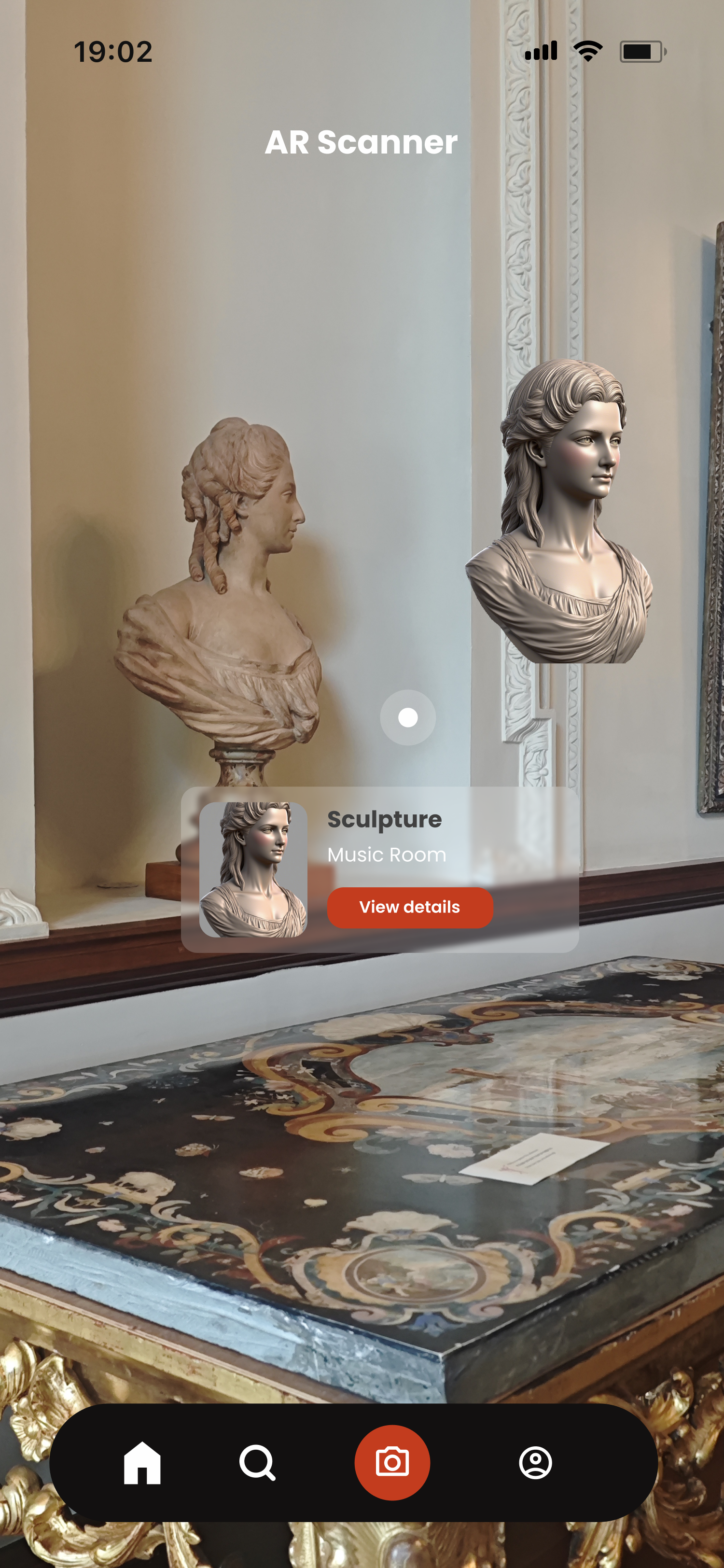
Carried forwardScan an exhibit for 3D models, audio stories and layered digital content — immersive, self-paced exploration of the collection.
Not progressedWe killed the AR concept — and merged the other two
The co-design session with the Russborough team dissected features rather than whole prototypes, which is what made the call obvious. AR read as gimmicky and overstimulating, overlapped with the Smartify system already in place, and raised safety concerns. Structure and storytelling were what the site actually needed.
Praised for clarity, routine and inclusivity. Seen as practical and scalable for enhancing SEND accessibility.
Valued for emotional impact and creativity. Encouraged reflection and connection, especially for neurodivergent users and children.
Gimmicky and overstimulating, misaligned with user needs, duplicating Smartify. Dropped at this stage.
Five features, each traceable to a theme. A booking code links the visitor to their tour group at onboarding — content stays relevant, group uploads are prioritised, and captioning can be group-specific. No code still gets you the public features.
Pre-planning & Preview
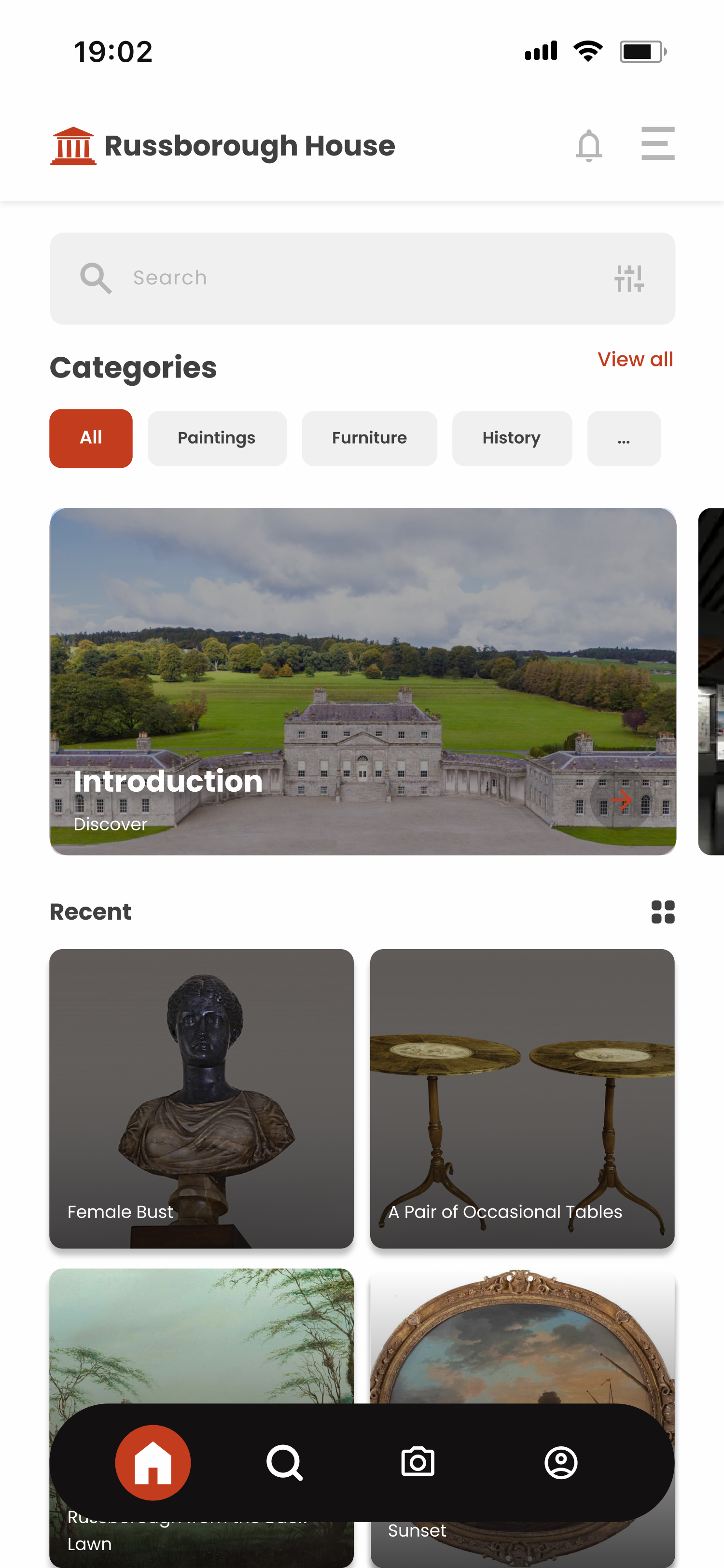
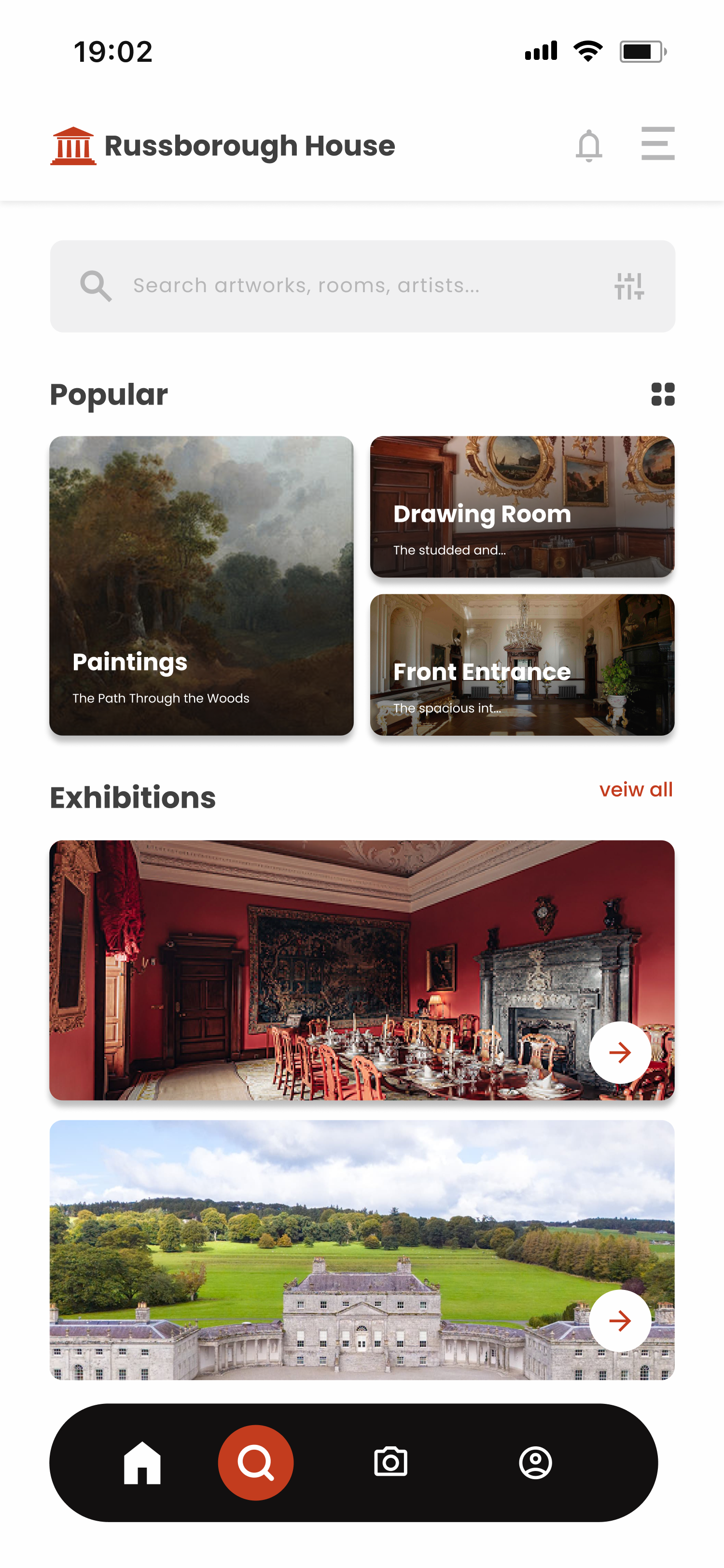
The home base after login: fill out the accessibility form, meet your tour guide, and see what there is to do. It doubles as the return point after any action or error, so users always land somewhere structured.
On-tour Support
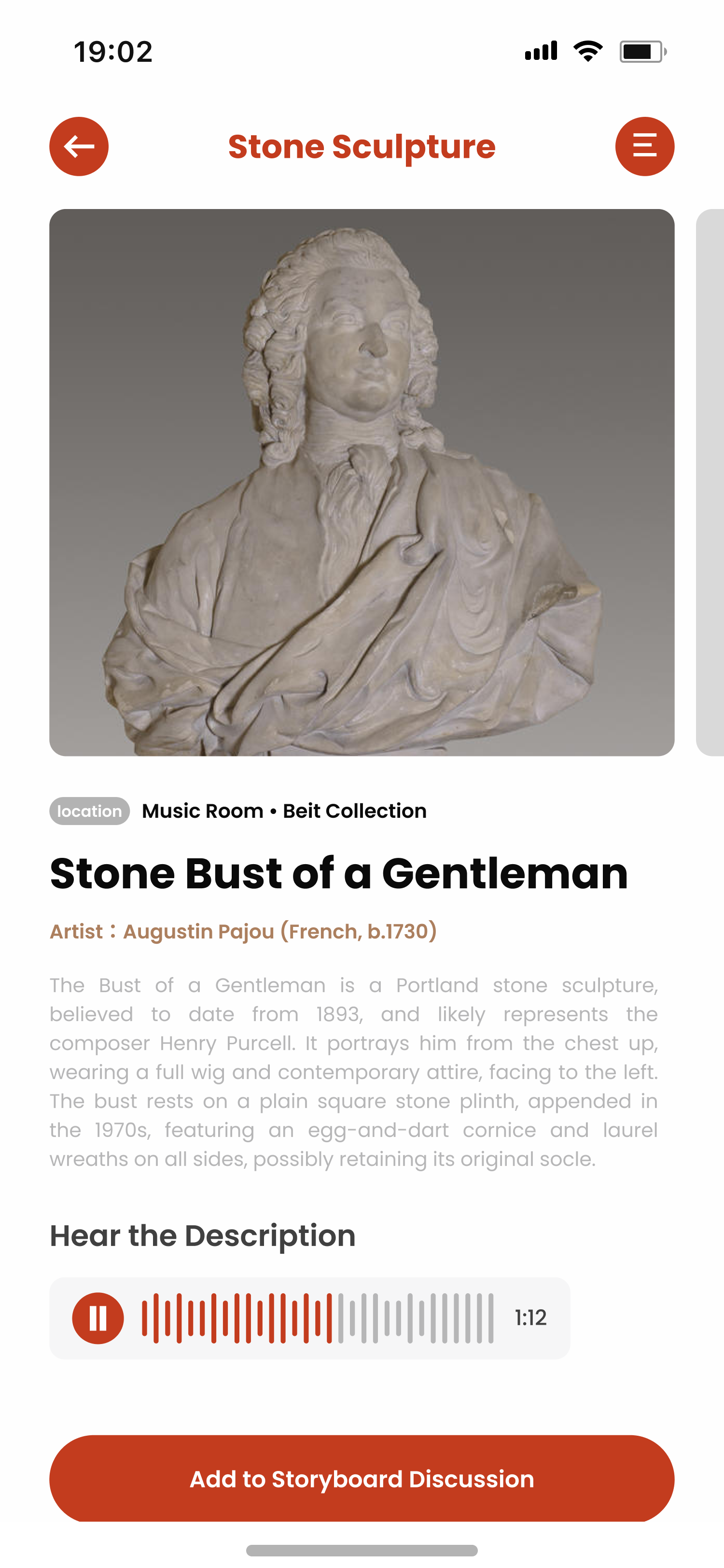
Room-by-room artefact descriptions and live captions during the tour, supporting both focused listening and independent exploration. A discreet assistance button lets a visitor alert the guide they need a break — without disrupting anyone.
Storyboard
A shared reflection space where visitors upload photos, captions and reactions tied to their visit — a living archive of multi-perspective heritage experiences, browsable with or without a group.
Camera
Capture an artefact or corner that mattered, add a reflective caption, publish it to the storyboard. Documentation without interrupting the flow of the visit.
Profile
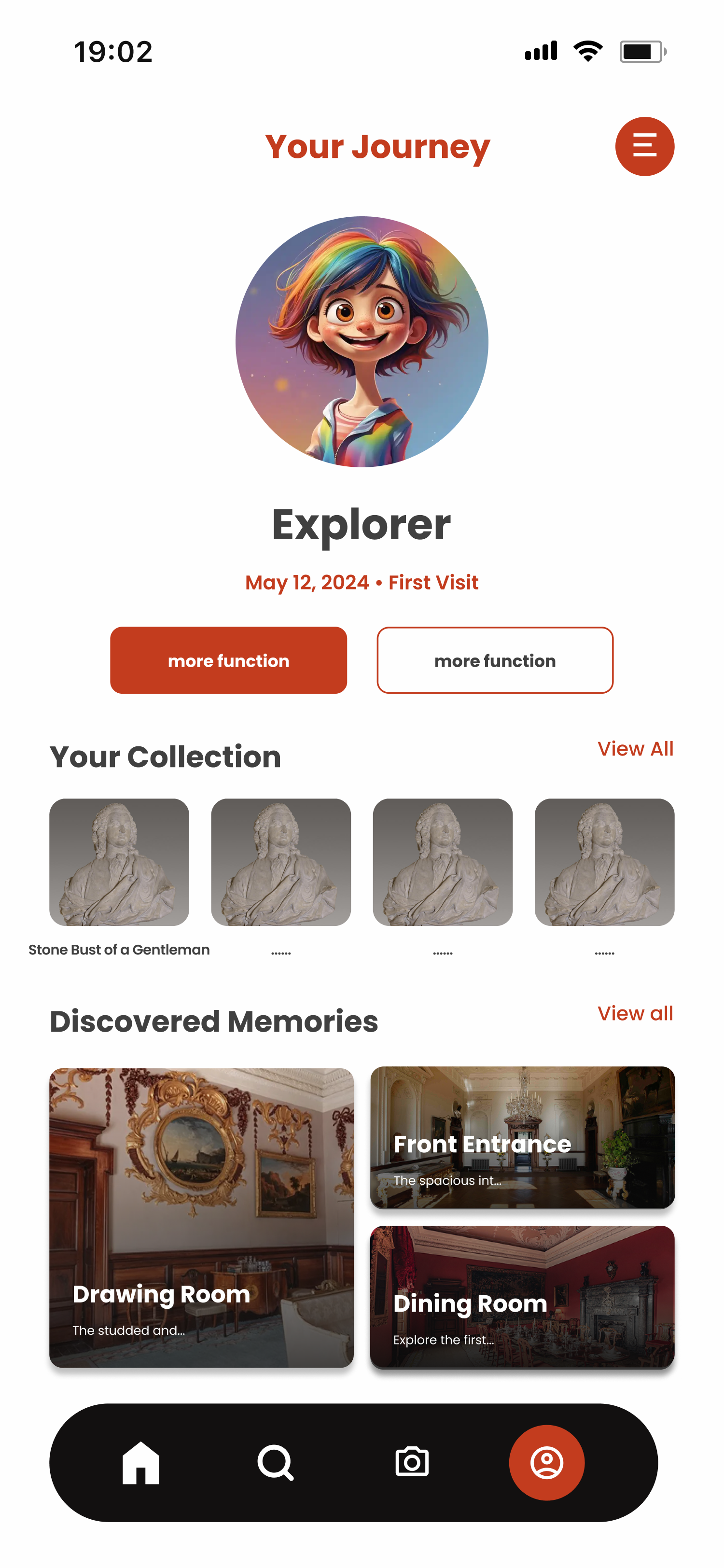
A lightweight support hub: revisit the accessibility checklist, manage tickets, adjust settings, get help navigating the app. Deliberately shallow.
A plain checklist — quiet zones, wheelchair access, permission to bring sensory aids like headphones — reachable from both the home screen and the profile, because people navigate differently. On submit it goes straight to the Russborough team ahead of the visit, so staff can prepare rather than improvise.
React Native and Firebase, with five microservices behind an API gateway — user, content, accessibility, websocket captioning and media. PostgreSQL for records, MongoDB for artwork metadata, MinIO for media. Booking-code access, real-time storyboards and downloadable content, reflecting the co-design priorities of predictability, inclusion and creative agency.
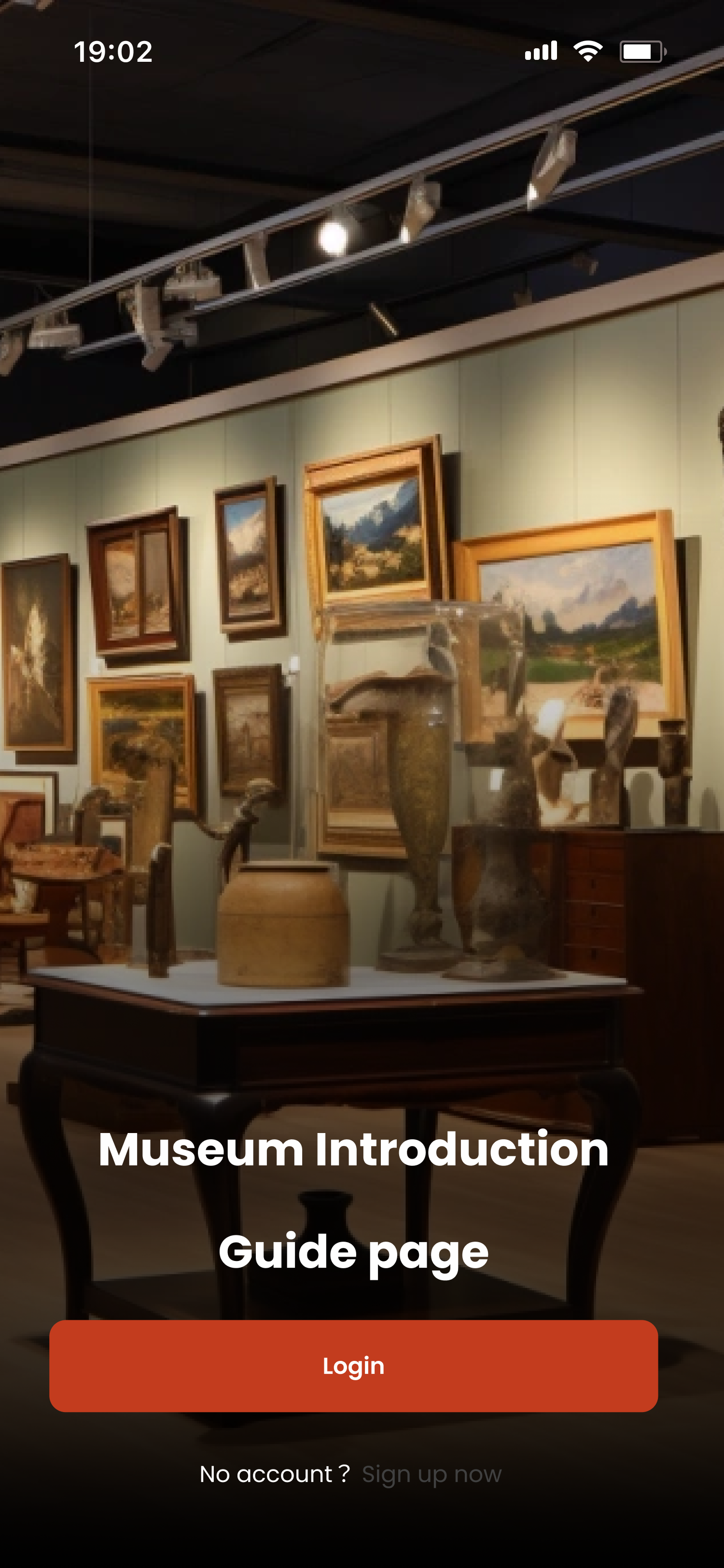
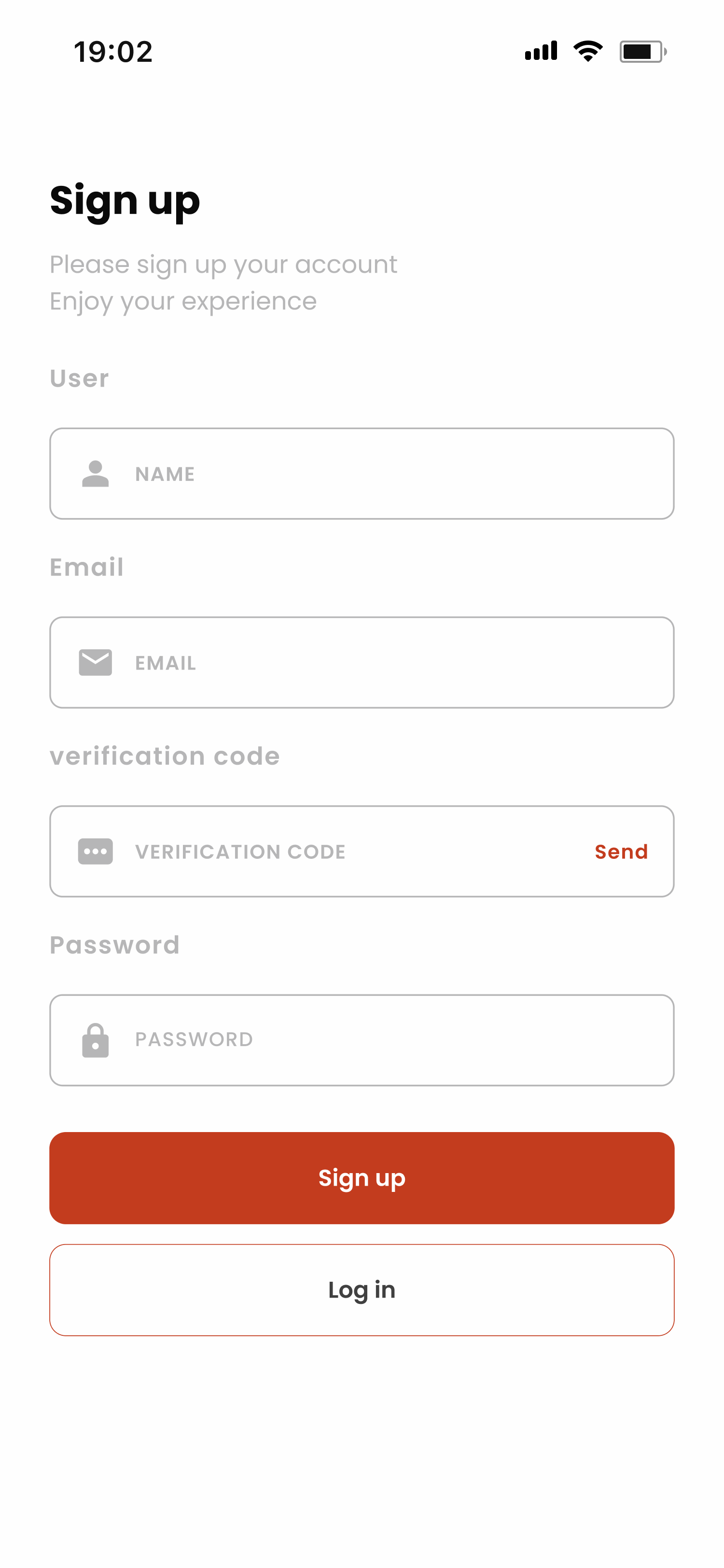
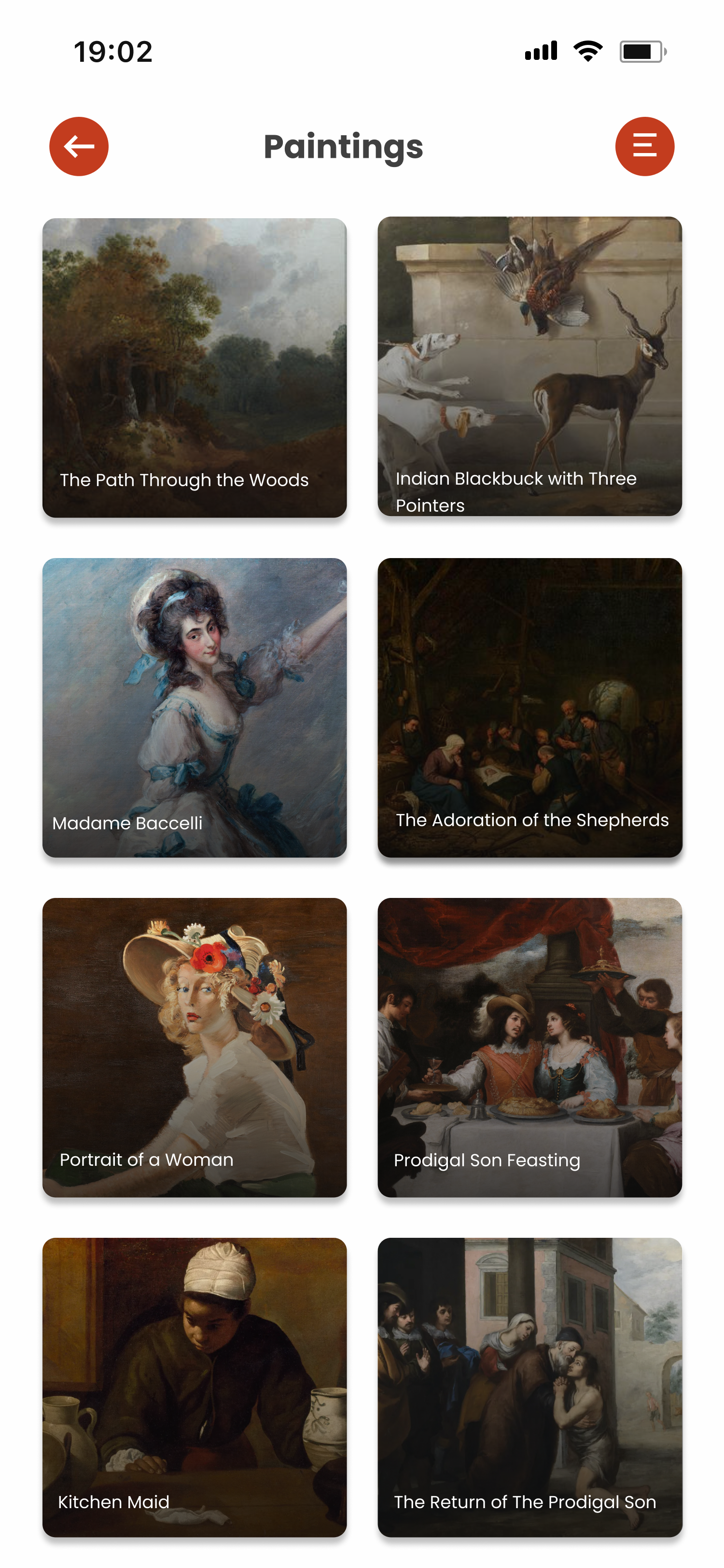
Onboarding and registration, home and search browsing, the exhibition grid, the AR scanner, artefact detail with an audio description, and the visitor's own journey profile.
A design that a small foundation-funded team can't operate isn't accessible either. We handed over a fourteen-month rollout covering staff training, operational workflows and infrastructure — not just a prototype.