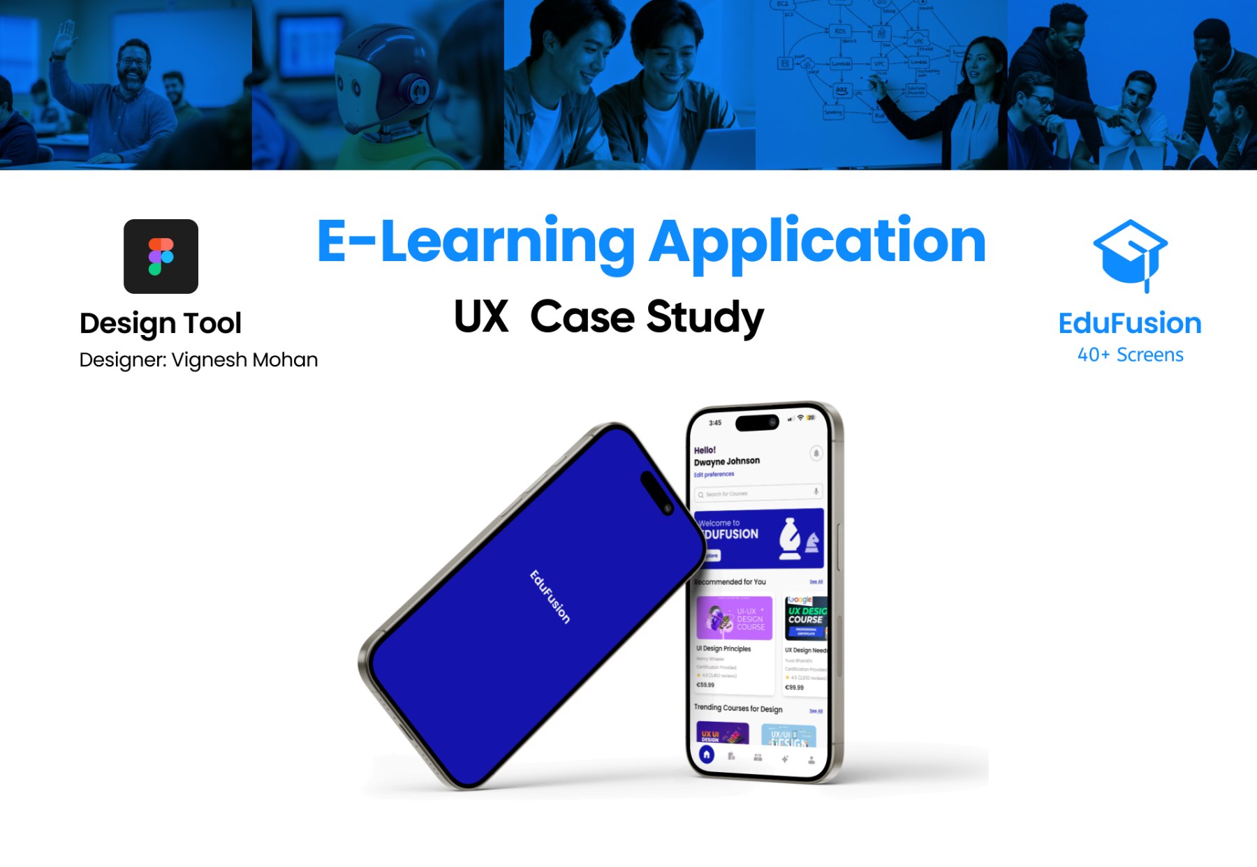
Online learning is everywhere. Completion is not. This is the story of how I reframed a dropout problem as a design problem — and built something that keeps learners going.
RoleProduct Designer
FocusEnd-to-End Product Design
ToolsFigma · Miro
Research18 Participants
Context
Online learning is everywhere. Completion is not.
Online learning has made education more accessible than ever. But accessibility alone doesn't guarantee engagement.
Many learners start courses with strong intent, yet very few complete them. This project explores that gap as a behavioural problem, not just a content problem.
The Problem
Learning is easy to start. Difficult to sustain.
Most learning platforms assume users are self-disciplined. They rely heavily on passive content and offer little real-time guidance.
As a result, users lose direction, feel overwhelmed, and eventually drop off. Learning becomes easy to start, but difficult to sustain.
The core tension: "Platforms give you content. Nobody gives you a reason to keep going."
Research & Insights
The challenge wasn't ability. It was lack of support.
I conducted research with 18 students and early-career learners to understand this behaviour. The challenge wasn't ability — it was lack of support.
Many users followed unstructured routines, jumping between platforms without a clear plan. Motivation dropped quickly without accountability, especially when learning alone.
18
Participants interviewed across student and early-career groups
3
Core failure points identified: structure, motivation, social accountability
100%
Of participants felt more engaged when learning alongside others
Another key issue was decision fatigue. With too many options and no guidance, users struggled to choose what to learn and how it aligned with their goals.
The key insight: learning breaks not because it is difficult, but because it lacks structure, guidance, and social accountability.
Survey Insights
Study Habits & Learning Patterns
Motivations & Feature Preferences
Design Direction
Help users stay engaged, not just get started.
Instead of designing another content-heavy platform, I focused on continuity. The goal was to help users stay engaged, not just get started.
This meant creating an experience that reduces uncertainty, supports progress, and introduces a sense of structure and connection throughout the learning journey.
Personas
Who we designed for.
Solution
A collaborative learning ecosystem, not a content library.
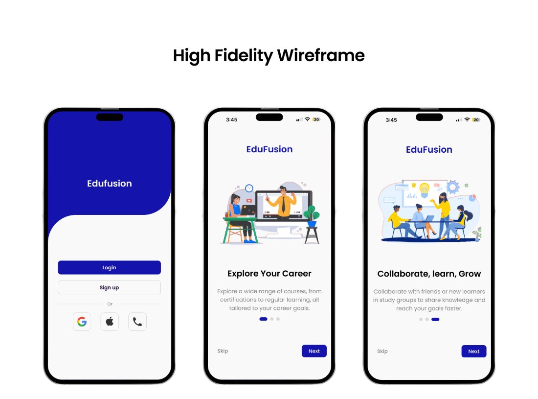
EduFusion was designed as a collaborative learning ecosystem. The experience combines structured learning with social interaction and real-time guidance.
👥
Study Groups
Study groups introduce accountability and shared progress, allowing users to learn alongside peers instead of in isolation.
🤖
AI Learning Assistant
An AI assistant helps users make decisions and clear doubts instantly — reducing friction at the exact moments users are most likely to drop off.
📅
Structured Learning Flows
Scheduling and progress tracking give users a clear path forward, replacing ambiguity with visible momentum they can feel and act on.
🎯
Personalised Recommendations
Goal-aligned recommendations reduce decision fatigue by surfacing what to learn next, rather than presenting an overwhelming catalogue of options.
Design Process
Structured from discovery through to testing.
The project followed a structured UX approach from discovery to testing. Each phase focused on simplifying the experience and aligning features with real user needs.
The emphasis was on clarity, reducing cognitive load, and supporting behaviour through design — not adding features for the sake of completeness.
01
Discover
02
Define
03
Ideate
04
Design
05
Test
Design Execution
Clean, focused, and intuitive.
The interface was designed to feel clean, focused, and intuitive. Every element was placed to guide users rather than overwhelm them.
Clear hierarchy and simple navigation help users move through the experience with confidence — the goal was never to impress, but to reduce every point of hesitation between intent and action.
Outcome
From a passive activity to a guided experience.
EduFusion transforms learning from a passive activity into a guided and social experience.
By addressing motivation, structure, and guidance, the platform supports users in staying consistent and completing their goals — shifting the experience from simply accessing content to actually progressing through it.
↑
Improved task completion and clarity in usability testing
↓
Reduced decision fatigue through structured flow and smart recommendations
✓
Social features validated as key driver of engagement and return rate
Reflection
Motivation is not just a user problem — it's a design problem.
This project showed me that motivation is not just a user problem — it's a design problem.
I learned that structure, guidance, and social interaction can significantly influence behaviour. The presence or absence of these things doesn't just affect how people feel about a platform — it determines whether they come back at all.
Good UX is not about adding features. It's about understanding how people actually think and act — and designing systems that support that reality rather than fighting against it.
Product Designer & UX Researcher who turns messy user problems into clear, intuitive digital experiences — from research to final interface. Based in Dublin. Open to product design & UX roles.
I combine research rigour with design craft — helping teams build products that are both usable and meaningful.
🎨
Product Design+
I design end-to-end digital products — from early wireframes and interaction models to polished, pixel-perfect UI in Figma. I translate user needs and business goals into intuitive, accessible interfaces that teams can actually ship.
FigmaPrototypingUI SystemsAccessibility
🔬
UX Research+
I uncover what users actually need — through interviews, surveys, usability testing, and thematic analysis. I turn raw findings into actionable insights: personas, journey maps, and service blueprints that keep design decisions grounded.
User InterviewsJourney MappingUsability TestingSynthesis
🗺️
Service Design+
I design for the full picture — mapping entire service ecosystems, identifying failure points, and creating blueprints that align stakeholders around a shared vision. Especially experienced in inclusive and accessible service design.
Service BlueprintsCo-designStakeholder Alignment
⚡
Interaction Design+
I craft the moments between screens — designing micro-interactions, transitions, and motion that make interfaces feel alive and responsive. Every tap, swipe, and state change is intentional, reducing cognitive load while building delight into the flow.
A collection of four end-to-end design projects spanning UX case studies, product design, and brand identity systems—from research and strategy to polished, high-fidelity execution.
UX Case Study
EduFusion — E-Learning Platform
Interaction Design · 40+ Screens
→
Students were dropping out of online courses. I exposed the real culprits — decision fatigue, unclear paths, and low motivation — then redesigned the experience to guide learners toward completion.
FigmaUser ResearchUsability Testing
Read Case Study →
UI/UX Case Study
GadgetGo — Gadget Rental Platform
End-to-End Product Design
→
Students and creators couldn't trust rental platforms — unclear pricing, complex booking, zero confidence. I rebuilt the experience with simplified flows and trust-building moments that drove bookings.
FigmaSurveysEnd-to-End UX
Read Case Study →
Service Design
Russborough House — Inclusive Heritage
Accessible Mobile App · Product Designer
→
A 300-year-old heritage site had invisible barriers shutting out SEND and neurodivergent visitors. I designed an inclusive app covering pre-visit planning, in-app support, and multimodal storytelling.
Service BlueprintCo-designInclusive Design
Read Case Study →
Live
Brand Identity · Product Ecosystem
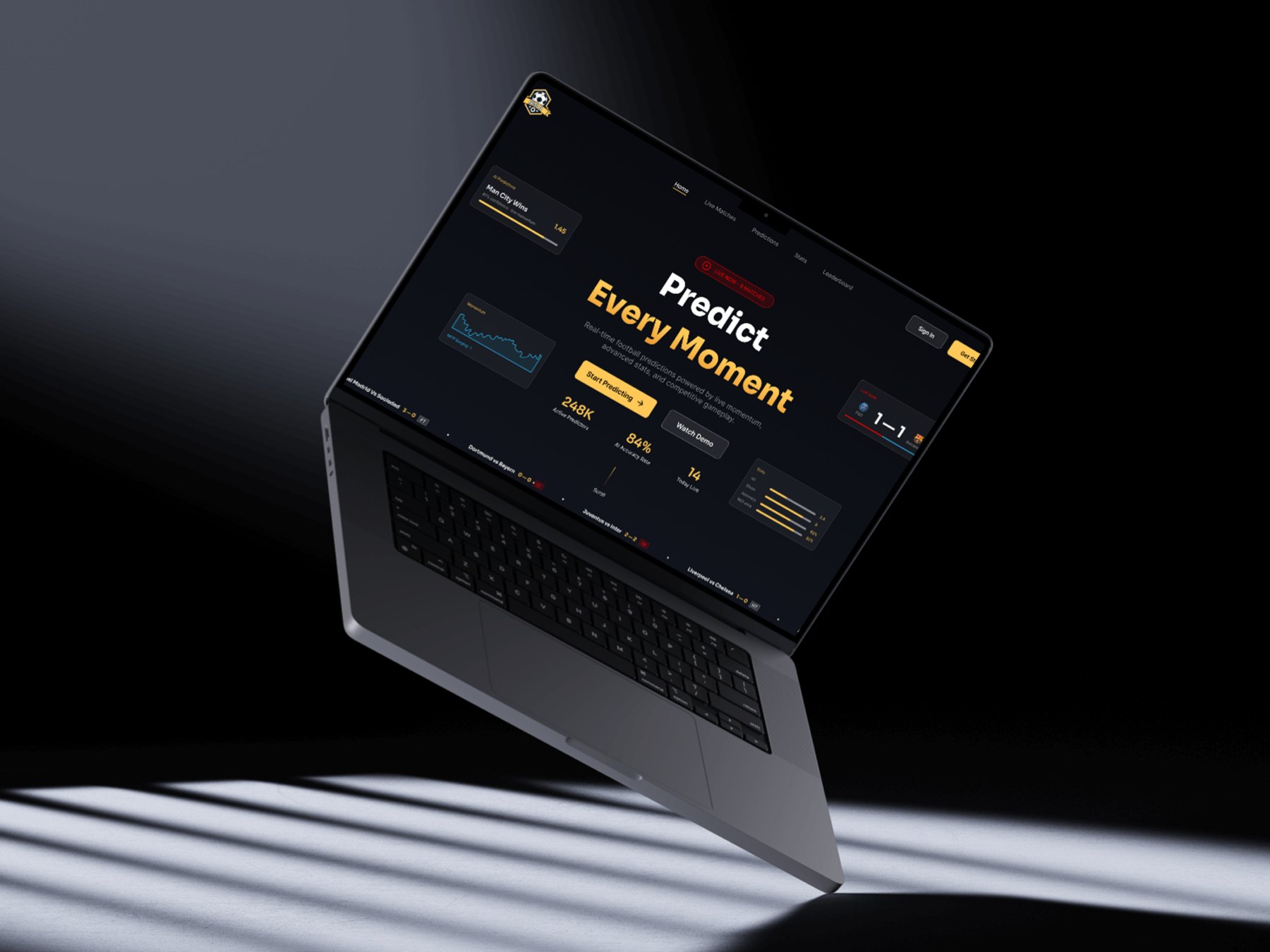
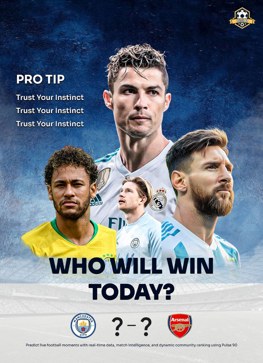
Pulse 90 — Football Prediction
Real-Time Prediction Platform · Visual Identity System
→
A cinematic football prediction ecosystem challenging conventional sportsbook aesthetics. Combining telemetry-inspired UI, live-data interaction, and premium brand identity into one immersive experience.
Brand IdentityProduct DesignMotion DesignDesign Systems
Explore Project →
Next Brand Challenge
Coming Soon
A new brand challenge is in the works — exploring identity, motion, and immersive product systems across a new digital space.
In ProgressBrand IdentityDesign Systems
Brand Identity
Brand Challenge · Product Ecosystem
Pulse 90 — Real-Time Football Prediction Ecosystem
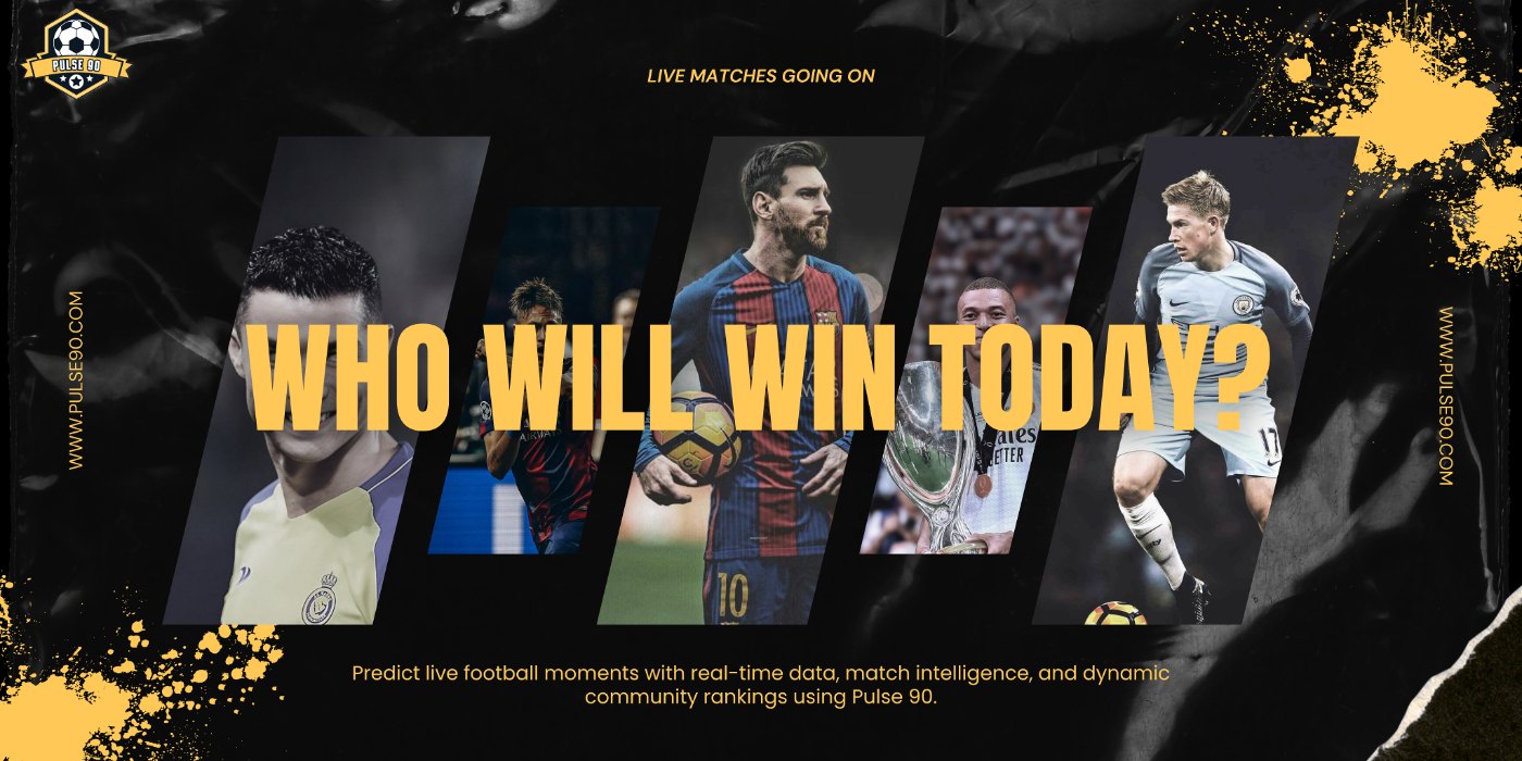
A concept-driven sports prediction platform designed to transform live football engagement into a visually immersive and emotionally charged digital experience.
TypeBrand Identity & Product
DisciplineVisual Identity & UX
ToolsFigma · After Effects
FocusFootball Prediction
Overview
A football experience built around momentum, instinct, and live match intensity
Pulse 90 is a concept-driven sports prediction platform designed to transform live football engagement into a visually immersive and emotionally charged digital experience. The project explores how strong brand identity, live match intelligence, and scalable product systems can coexist within a modern sports ecosystem built for highly active football audiences.
Rather than positioning predictions as purely transactional interactions, the platform reframes live football engagement as an emotionally driven and community-oriented experience shaped by momentum, instinct, and live match intensity.
"The project was designed to challenge the conventional visual direction commonly associated with sportsbook and prediction platforms by introducing a more cinematic, energetic, and identity-driven product ecosystem."
By combining real-time match tracking, prediction interactions, telemetry-inspired analytics, community competition, and cinematic sports storytelling — Pulse 90 creates a football experience that feels immersive, competitive, and visually recognisable across every touchpoint.
Brand Challenge
Breaking free from interchangeable sportsbook aesthetics
The sports prediction industry is heavily dominated by repetitive interface patterns and visually interchangeable product experiences. Many existing platforms prioritise information density and aggressive betting-focused layouts while often neglecting emotional engagement, recognisable visual identity, immersive interaction systems, and scalable brand consistency.
As a result, many sports products feel functionally useful but visually forgettable. The challenge behind Pulse 90 was to create a visually distinctive football prediction ecosystem that could balance real-time usability, immersive sports storytelling, scalable product systems, emotionally engaging interaction design, and recognisable brand identity within one connected experience.
01
Real-time usability without cognitive overload
02
Cinematic storytelling meets functional UI
03
Scalable across product & campaign touchpoints
04
Premium aesthetics without visual noise
The objective was not simply to create another sports dashboard, but to build a football ecosystem that feels alive during live match moments while maintaining clarity, hierarchy, and usability across complex live-data environments.
Brand Direction
Underground football culture meets precision telemetry
The visual direction for Pulse 90 was inspired by the atmosphere and emotional intensity surrounding modern football culture. The identity system draws influence from underground football aesthetics, sports broadcast graphics, Formula 1 telemetry systems, competitive gaming interfaces, and modern sports entertainment platforms.
The goal was to merge the raw emotional energy of football culture with the structure and precision of scalable digital product systems. This resulted in a visual language built around layered dark surfaces, oversized typography, gritty textures, live-data overlays, telemetry-inspired visuals, cinematic contrast, and neon-accented highlights — creating a premium football intelligence aesthetic.
⚡
Layered Dark Surfaces
Deep, textured backgrounds that evoke the intensity of stadium atmospheres and night matches, creating visual depth without sacrificing legibility.
🎯
Telemetry-Inspired Visuals
Data overlays and analytics visualisations drawn from F1 telemetry and broadcast sports graphics, making complex match data feel dynamic and engaging.
🟢
Neon Live Indicators
Neon green live-state signals and alert systems that communicate real-time match activity with immediate visual clarity and emotional urgency.
🏆
Premium Gold Highlights
Restrained gold accents used for ranking, achievements, and premium prediction moments — reinforcing the competitive and aspirational nature of the platform.
Visual Identity System
Typography, colour, and motion working as one system
The Pulse 90 identity system was designed around the concepts of momentum, immersion, and competitive energy. Typography became one of the core elements shaping the platform's personality.
Sora was used across hero headlines, live match scores, prediction moments, and major numerical hierarchy — establishing a bold, futuristic, and energetic visual tone that reflects the intensity of live football experiences.
Inter was used throughout the product experience for navigation systems, live dashboards, telemetry interfaces, prediction modules, and supporting content — maintaining readability and scalability across data-heavy environments.
"The combination of typography, colour, motion, and live-data elements helped establish a recognisable visual identity that scales consistently across both product and campaign touchpoints."
The colour palette was intentionally restrained to preserve hierarchy and recognisability. The system primarily relies on layered dark backgrounds, soft gradients, neon green live indicators, telemetry-inspired blues, sports-inspired alert reds, and premium gold highlights — creating strong visual emphasis during active live states.
Brand Expression
A visual language that scales beyond the dashboard
A major focus of the project was exploring how the Pulse 90 identity system could scale beyond the core product experience. The visual language was extended across campaign posters, environmental graphics, collectible-style prediction cards, editorial sports visuals, responsive website assets, and digital product marketing materials.
📣
Campaign posters & environmental graphics
🃏
Collectible-style prediction cards
📱
Responsive web & product assets
📰
Editorial sports visuals
This helped position Pulse 90 as a flexible and scalable sports identity capable of adapting fluidly across multiple audience interactions while maintaining one cohesive visual language.
Product Experience
A connected multi-page ecosystem for live football engagement
The Pulse 90 product experience was designed as a connected multi-page ecosystem focused on live football engagement. The platform combines live match dashboards, prediction systems, telemetry-inspired analytics, leaderboard environments, and community interaction layers within one scalable interface system.
Each product area was intentionally separated into focused experiences while remaining connected through one cohesive design system. The interface prioritised rapid information scanning, live-state responsiveness, immersive interaction, modular scalability, and visual clarity during high-intensity moments.
Live Match Dashboard
The live dashboard became one of the core interaction layers within the Pulse 90 ecosystem. The experience was designed to simulate the atmosphere of watching a live football broadcast while interacting with predictive match intelligence in real time. The dashboard combines live score tracking, momentum analytics, possession statistics, telemetry-inspired visualisations, match switching systems, and activity feeds within one cohesive environment.
📊
Telemetry Widgets
Reusable momentum-driven graph components that communicate match energy and pressure shifts in real time with smooth, broadcast-style transitions.
🔮
Prediction Modules
Focused interaction zones designed for rapid prediction input during high-pressure live moments, with confirmation feedback and animated live states.
🏅
Leaderboard & Community
Ranking components and social layers that reinforce the competitive, community-driven nature of the platform across sessions and matchdays.
Motion & Interaction
Motion as a functional communication layer
Motion was treated as a functional layer of communication rather than decorative animation. The interaction system was designed to reinforce live intensity, responsiveness, emotional engagement, active gameplay feedback, and state awareness through subtle but meaningful motion behaviours.
"The interaction rhythm was intentionally designed to feel fast, responsive, premium, and smooth — similar to modern sports broadcast systems and high-performance digital products."
Micro-interactions included magnetic hover effects, animated live indicators, momentum-driven graph transitions, responsive glow states, animated score updates, hover depth systems, and prediction confirmation feedback. The objective was to create an experience that feels reactive and immersive while ensuring motion never interrupts readability or usability.
Responsive & Scalable
Preserving the immersive atmosphere across all screen sizes
A modular component architecture was developed to ensure consistency across live dashboards, prediction interfaces, leaderboard modules, analytics systems, and responsive layouts. Reusable systems included live match cards, telemetry widgets, prediction modules, ranking components, navigation systems, and analytics visualisations.
The responsive system was designed to preserve the immersive football atmosphere across multiple screen sizes while maintaining clarity during high-intensity live interactions. Rather than simply resizing layouts, the responsive experience focused on restructuring interaction priorities based on viewing context and user behaviour.
Outcome
Reimagining football prediction as a cinematic live experience
Pulse 90 demonstrates how strong brand identity, scalable product systems, and immersive sports interaction can coexist within a modern football prediction ecosystem. The project challenged conventional sports interface aesthetics by combining cinematic football storytelling, telemetry-inspired UI systems, modular product thinking, responsive interaction design, and motion-led feedback systems into one connected experience.
The final outcome explores how emotionally recognisable branding can enhance usability while creating a sports platform that feels visually distinct, immersive, and scalable across both product and campaign environments.
"By merging sports culture, live-data interaction, and premium digital design systems, Pulse 90 reimagines football prediction as a cinematic and emotionally engaging real-time experience rather than a conventional sportsbook interface."
Reflection
What this project strengthened
This project deepened my understanding of scalable brand systems, motion-led interaction design, live-data UX patterns, responsive sports interfaces, modular product architecture, and emotionally driven visual storytelling.
It also reinforced the importance of designing products that feel not only functional, but emotionally memorable and visually recognisable within highly competitive digital industries.
🎨
Scalable brand systems across touchpoints
✨
Motion-led interaction design principles
📡
Live-data UX patterns & information hierarchy
🧩
Modular product architecture & design systems
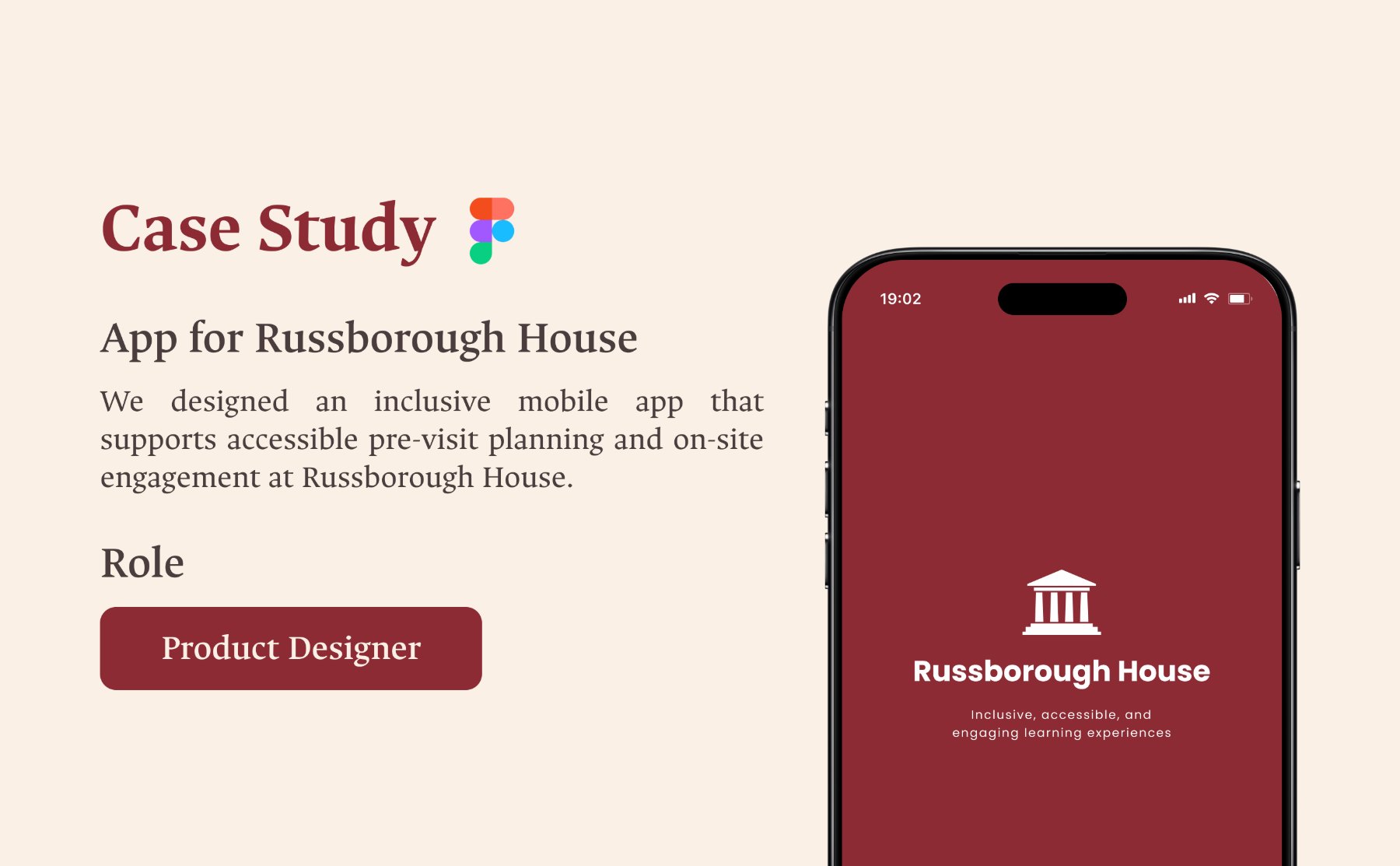
Service Design
Case Study · 2025
Russborough House — Inclusive Heritage Experiences
One of Ireland's most significant heritage sites presented a fundamental challenge: how do you create meaningful access for all visitors without altering the physical space? This is the story of designing inclusion within constraint.
A site of cultural significance, not equally experienced by all.
Russborough House is one of Ireland's most celebrated heritage sites, renowned for its Palladian architecture and rich cultural history. While the space offers a deeply rewarding experience, its physical and experiential structure presents real challenges for diverse audiences.
This project explored how heritage spaces can become more inclusive without compromising their historical integrity — a tension at the heart of accessible design in protected environments.
The Problem
Access is about more than physical movement.
Despite its cultural value, Russborough House is not equally accessible to all visitors. Physical limitations restrict movement through the space, while existing experiences rely heavily on visual and auditory formats that do not serve everyone.
Visitors such as neurodivergent individuals, families with SEND children, and those with sensory or cognitive differences face barriers that limit meaningful engagement. This creates a fundamental tension between preservation and inclusion.
The challenge was not just physical accessibility — it was about how information is presented, paced, and experienced by people with vastly different needs.
Research & Insights
Accessibility extends beyond ramps and lifts.
Through interviews, surveys, and stakeholder collaboration, it became clear that the barriers visitors faced were primarily experiential, not just physical. Many struggled with how information was structured and delivered, not how they moved through the space.
Traditional guided tours assume a linear way of learning — a format that does not reflect diverse user needs. A key insight emerged from the research:
Accessibility is not just about removing barriers. It is about enabling participation for different ways of experiencing the world.
01
Neurodivergent visitors and SEND families were underserved by existing tour formats
02
Information overload and linear pacing created disengagement for many visitor types
03
Stakeholders were open to digital interventions that preserved the physical heritage
Design Direction
Inclusion within constraint.
Since structural changes to a protected heritage site were not possible, the design challenge shifted: how can digital and sensory experiences extend and enrich the visit without altering the physical environment?
The approach moved away from a fixed, prescriptive path towards adaptable, user-centred interactions — allowing visitors to engage with content in ways that suit their individual needs and preferences.
Solution
Multi-sensory experiences that complement the space.
The solution introduced inclusive, multi-sensory experiences layered over the existing environment. Digital layers, storytelling elements, and flexible interactions allow visitors to engage with content in ways that suit them — without a fixed path or format.
🌐
Digital Storytelling Layers
Content delivered through adaptable digital interfaces, allowing visitors to explore at their own pace and depth — without being locked into a single narrative structure.
🎧
Multi-Sensory Interactions
Visual, auditory, and tactile experiences balanced to support a wide range of user needs, including visitors with sensory processing differences.
🧩
Flexible, Non-Linear Journeys
Rather than a prescribed tour, visitors can choose entry points and engagement levels — transforming passive observation into active, personalised participation.
Design Process
Collaborative, research-driven, and iterative.
The project followed a collaborative approach involving stakeholders, educators, and accessibility advocates throughout. Insights were synthesised into personas and design opportunities, guiding the development of concepts and prototypes through iterative feedback cycles.
01
Research & Discovery
02
Stakeholder Collaboration
03
Personas & Insights
04
Concept Development
05
Prototyping & Testing
Design Execution
Clarity, flexibility, and inclusivity by design.
The design prioritised gradual exploration over information overload. Content was structured so visitors could go as deep — or as light — as they needed, without ever feeling lost or overwhelmed.
Visual, auditory, and interactive elements were carefully balanced to support a wide range of user needs while maintaining the character and integrity of the heritage space.
Outcome
Heritage that works for everyone.
The project demonstrates how inclusive design can enhance heritage experiences without physical intervention. By introducing adaptable and accessible interactions, Russborough House becomes more engaging for a significantly broader audience.
↑
Broader audience reach through adaptable, non-linear visitor journeys
✓
Inclusive experiences delivered without altering the protected physical environment
♿
Meaningful engagement unlocked for neurodivergent visitors and SEND families
Reflection
Constraints can drive meaningful innovation.
This project taught me that working within limitations — rather than around them — often leads to the most creative solutions. The inability to make structural changes forced me to think beyond conventional approaches and find value in digital and experiential design.
I also learned that accessibility is not a feature to be added at the end of a design process. It is a mindset that shapes every decision — from how content is structured to how interactions are paced and presented.
The most important takeaway: when you design for those who face the greatest barriers, you create experiences that work better for everyone.
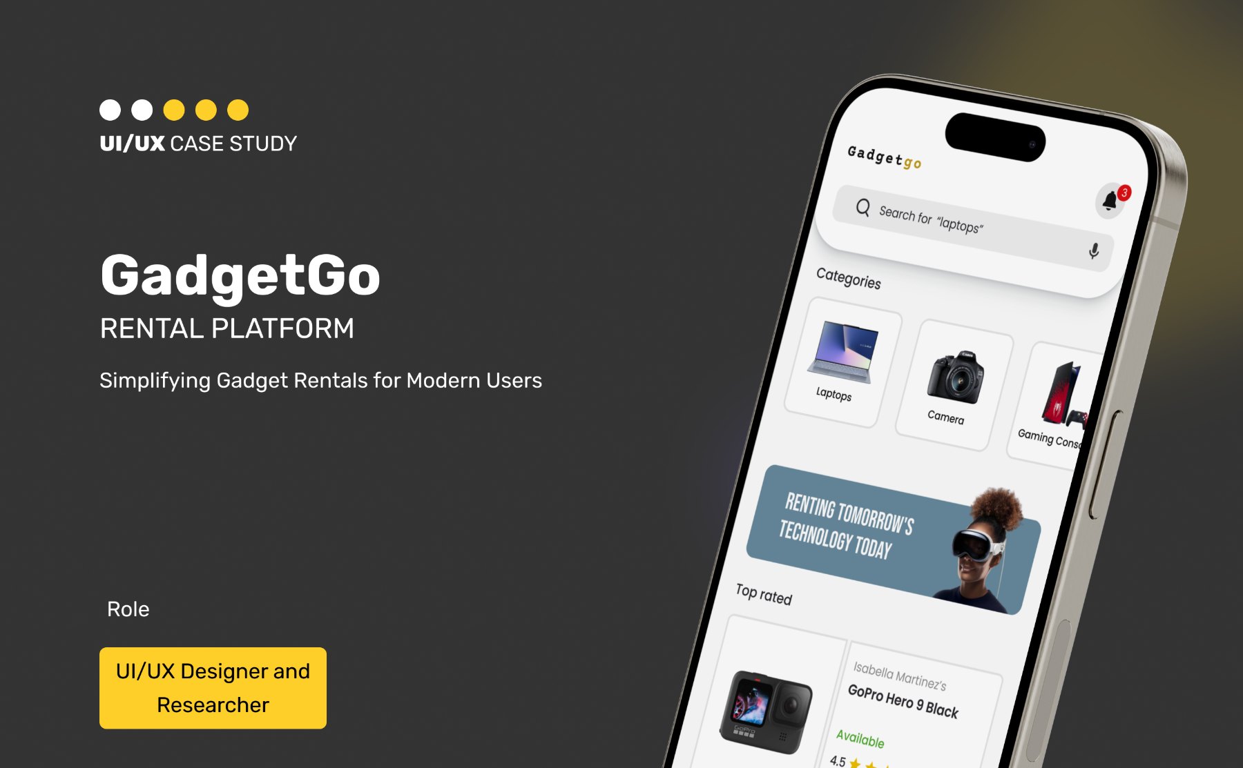
Renting a device should feel as easy as using one. This is the story of how I turned a confusing, friction-heavy rental experience into something simple, transparent, and trustworthy.
RoleProduct Designer
FocusEnd-to-End Product Design
ToolsFigma · Miro
MethodsCompetitor Analysis · User Flows
Context
Access to technology matters. Ownership doesn't have to.
Access to technology is essential for students, freelancers, and creators — but owning every device isn't always practical. Renting offers flexibility, yet the experience often feels unnecessarily complex.
GadgetGo explores how a rental platform can become more intuitive, transparent, and user-friendly — so the focus stays on what users need, not the process of getting it.
The Problem
Plenty of options. Not enough clarity.
Most rental platforms provide access to a wide range of products, but the experience around them is often confusing. Users struggle to navigate large inventories and understand availability clearly.
The booking process can feel long and uncertain — too many steps, not enough clarity. This creates hesitation, even when users genuinely need a device.
The core tension: "I know what I need. I just don't know if I can trust this platform enough to actually book it."
Research & Insights
The challenge wasn't access. It was the experience itself.
Through competitor analysis, it became clear that the challenge wasn't access to products — it was the experience built around them. Existing platforms offer variety, but often at the cost of simplicity and usability.
Users need more than options. They need confidence. Concerns around pricing, product condition, and reliability heavily influence decisions at every stage of the journey.
Inventory breadth across competitors — but usability and clarity consistently poor
✓
Trust identified as the deciding factor between browsing and completing a booking
The key insight: renting is not just a transaction — it's a trust-driven experience. If users don't feel confident at each step, they are unlikely to proceed.
Design Direction
Reduce friction. Increase clarity.
The focus shifted towards reducing friction and increasing clarity. Instead of adding more features, the goal was to simplify the journey from discovery to booking.
The experience needed to feel predictable, transparent, and efficient at every stage — removing uncertainty before it had a chance to create doubt.
Solution
A streamlined rental experience built on trust.
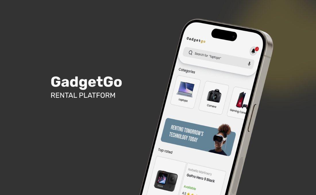
GadgetGo was designed as a streamlined rental experience that prioritises ease of use. The platform guides users through a clear and structured flow, from browsing devices to completing bookings.
🗂️
Clean Navigation & Categories
Well-defined categories and clean navigation help users quickly find what they need — reducing the cognitive load of browsing large inventories.
💡
Transparent Product Details
Product condition, availability, and pricing are presented clearly at every stage — reducing uncertainty and supporting confident, informed decisions.
📋
Structured Booking Flow
Each step in the booking process feels intentional and easy to follow — removing the hesitation that comes from long, ambiguous multi-step processes.
🤝
Trust-Building Moments
Clear confirmations, visible policies, and consistent feedback signals at key decision points build the confidence users need to complete a rental.
Design Process
Analyse, identify gaps, then simplify.
The process involved analysing existing platforms, identifying usability gaps, and iterating on simplified user flows. The focus remained on aligning the experience with user expectations while removing unnecessary complexity at every stage.
01
Analyse
02
Define
03
Ideate
04
Design
05
Refine
Design Execution
Clean, modern, and easy to read.
The interface was designed to feel clean and modern, with a strong emphasis on hierarchy and readability.
Clear call-to-action elements and consistent layouts guide users naturally through the platform — ensuring a smooth, predictable interaction at every step, without requiring users to think about the interface itself.
Outcome
Simple, reliable, and intuitive.
GadgetGo transforms the rental experience into something simple, reliable, and intuitive.
By reducing friction and improving clarity, the platform allows users to focus on their needs rather than the process itself — turning a previously hesitation-driven experience into one built on confidence.
↓
Reduced booking friction through a simplified, step-by-step flow
↑
Increased confidence through transparent pricing and product information
✓
Trust signals embedded throughout the journey to support decision-making
Reflection
Trust is the real product.
This project reinforced the importance of trust in product design. Even small points of friction can create hesitation in decision-making — and hesitation, left unaddressed, becomes abandonment.
I learned that simplifying experiences is not just about efficiency. It's about building confidence and reducing uncertainty at exactly the moments when users are most likely to second-guess themselves.
The lesson I'll carry forward: when users feel certain about what's happening and what comes next, they don't just complete tasks — they trust the product. And trust is what brings them back.
The interactive mobile prototype for EduFusion — guided onboarding, personalised learning paths, and micro-interaction polish across the full user flow.
A high-fidelity mobile prototype for GadgetGo's device rental platform — smooth onboarding, transparent rental flows, and trust-building micro-interactions designed to reduce friction and boost user confidence.
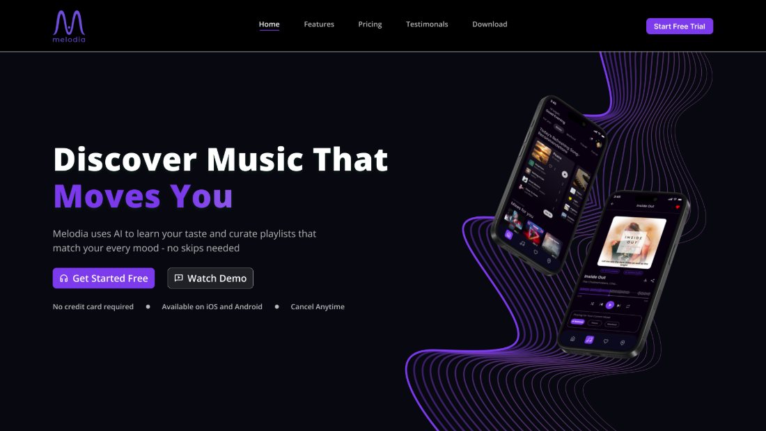
A modern music streaming landing page with immersive visuals, bold typography, premium layouts, and smooth interaction design.
How I Work
My Design Process
A structured, human-centred approach that moves from understanding to impact — and keeps iterating.
01
Discover
Interviews, surveys, and competitor analysis to understand the real problem space before any design begins.
02
Define
Synthesising findings into personas, journey maps, and clear problem statements that anchor every design decision.
03
Design
From information architecture and wireframes to high-fidelity prototypes — purposeful, not decorative.
04
Test
Usability testing, co-design workshops, and feedback loops to validate assumptions with real users.
05
Refine
Iterating on insights until the solution is clear, accessible, and ready for development handoff.
My Story
My Journey
Chennai → Dublin
From circuits to human-centred design
I started in electronics engineering in Chennai — a foundation that taught me systems thinking and precision. But I kept finding myself more drawn to the human side of technology: why people struggled with tools that were supposed to help them.
That curiosity drove me to pursue an MSc in Human-Computer Interaction at University College Dublin — one of Europe's leading programmes for design research. Moving to Dublin wasn't just a geographical shift. It was a commitment to doing the work properly.
Since arriving, I've designed for heritage accessibility, e-learning engagement, and product trust — working across research, UX, and UI with real stakeholders and real users. Alongside this, I've begun integrating AI into my design workflow to accelerate UI exploration, refine design systems, and stay aligned with evolving industry practices.
Every project has sharpened the same conviction: good design is invisible, and great design changes behaviour.
Quick Snapshot
✦
Engineered to design. Background in Electronics gives me a systems lens most designers don't have.
🎓
MSc HCI, UCD Dublin. Trained at the intersection of research, cognitive science, and product design.
🌍
Designed across cultures. From Chennai to Dublin — empathy isn't just a method, it's a lived experience.
🚀
Ready to contribute. Actively seeking product design and UX research roles in Dublin and beyond.
🤖
AI-augmented workflow. Leveraging AI tools to speed up UI design, iterate faster, and stay aligned with modern product design trends.
Education
2024 — 2025
MSc Human-Computer Interaction
University College Dublin · Dublin, Ireland
2019 — 2023
BE Electronics & Communication Engineering
Vel Tech Multi Tech Engineering College · Chennai, India
Certifications
2023 — 2024
UI/UX Design Certification
WebD School · India
2026 — Ongoing
Google UX Professional Certification
Google · In Progress
Toolkit Proficiency
🖊️
Figma
UI Design & Prototyping
🖼️
Adobe Photoshop
Image & Visual Editing
✏️
Adobe Illustrator
Vector & Graphic Design
📐
Framer
Web Design & Animation
🗂️
Notion
Documentation & Planning
🗓️
Jira
Project & Agile Management
🗺️
Miro
Workshopping & Mapping
🌐
WordPress
Web Publishing & CMS
🤖
ChatGPT & Claude
AI Assistants & Research
✨
Sleek Design
AI-Powered UI Design
🎨
AI UI Generators
Generative Design Tools
Experience
February 2026 – Present
Junior Product Designer (Contract)
PixelDrip · Bangladesh (Remote)
Designed and delivered a complete application within a 3-month timeline
Conducted user research and usability testing, iterating from wireframes to high-fidelity UI in Figma
Collaborated with cross-functional stakeholders to define requirements and translate them into accessible, intuitive solutions
May 2025 – August 2025
Product Designer
Russborough House · Wicklow, Ireland
Led user research across diverse visitor groups, surfacing key accessibility and usability challenges
Synthesised findings into personas, journey maps, and key insights that guided design decisions
Designed information architecture, navigation flows, wireframes, and prototypes for stakeholder communication
📍 Dublin, Ireland
About Me
Designer who thinks before they sketch
I'm a junior product designer and UX researcher based in Dublin — trained at UCD, shaped by real-world projects, and driven by a belief that good design should make people feel capable, not confused.
My background in engineering means I bring systems thinking to every brief. I don't just design screens — I understand flows, constraints, and the invisible architecture that makes interfaces feel effortless. Currently open to full-time product design and UX roles.
🖍️ Figma & Prototyping
🔍 User Research
🗺️ Journey Mapping
♿ Inclusive Design
📐 Information Architecture
🧩 Systems Thinking
📊 Miro & Mural
🤝 Stakeholder Co-design
Let's Talk
Ready to hire a designer who does the research?
I'm actively looking for product design and UX research roles in Dublin (and remote). If you're building something that should feel better to use — let's talk.